CMS’s Medicare Plan Finder website is difficult to use, GAO says

The central website that Medicare’s 60 million beneficiaries must use to choose their coverage option is difficult to use and sometimes produces incomplete information, the Government Accountability Office has found.
Simply navigating the Medicare Plan Finder (MPF) page on Medicare.gov can be a challenge, the watchdog agency writes in a report published Tuesday. Getting through the various pages takes a long time, and users are unable to jump directly to the sections that cater to their needs.
And that’s just the beginning — once users finally reach the page to compare plans, they tend to struggle to understand what’s written there. Per a report by advocacy groups, “the website explains health coverage terminology poorly and does not use plain language,” GAO writes.

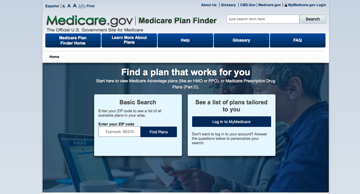
The current MPF page. (Screenshot)
Stakeholders interviewed by GAO also said the information on the website is sometimes incomplete with regard to cost and coverage. This makes it difficult for beneficiaries to truly decide what plan is best for their needs which, of course, is specifically what they came to the website to do in the first place.
But there’s good news ahead — the Centers for Medicare and Medicaid Services (CMS) is planning to launch a revamped MPF site this fall. The redesigned site will roll out in phases, CMS said, starting in early August and completing by the Medicare open enrollment period in October 2019.
“With the redesign, CMS plans to improve the navigation of MPF by providing more prominent explanations on how to use MPF; reducing the steps users must take to get to more detailed coverage information; configuring MPF so users can more easily switch between different topics inside MPF, such as switching between [Medicare Advantage] plan information and Part D plan information; and improving the filter and sort functions so users can narrow down their coverage options more quickly,” GAO states. “CMS also plans to make information easier to understand by simplifying and reducing the volume of information on the pages and revising frequently misunderstood terms with more user-friendly language.”
CMS told GAO it is soliciting user feedback on the redesign, which it hopes will help overcome the usability challenges that the legacy site suffers from.


