Consumer Product Safety Commission brings a touch of ‘Weird Twitter’ to the federal government

Picking a favorite Consumer Product Safety Commission tweet is like trying to pick a favorite puppy — how does one choose when there’s such a plethora of unique, enthusiastic options?
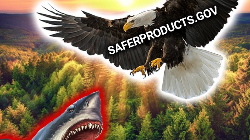
Once CPSC advertised the product safety site SaferProducts.gov with a tweetstorm of images showing an imagined battle between a shark (representing unsafe products) and an eagle (SaferProducts.gov), all of which was superimposed over a majestic forest landscape (for no immediately apparent reason). Another time the account reminded followers to water their Christmas trees by posting a picture of a cactus wearing sunglasses and a Santa hat. “And Reggye the Christmas Cactus learned a very special lesson that year — Keep your Christmas tree well watered for good tidings and great cheer,” the text reads.
Part of what makes the feed so eye-catching is that it is fairly unique among federal agency Twitter accounts. While other agencies tend to stick to themes both informative and promotional, CPSC Twitter joins viral hashtags and tweets out graphics that have an undeniably meme-like quality. It is, frankly, a little weird.
So how’d this happen? FedScoop called CPSC social media specialist Joe Galbo to find out.

Joe Galbo. (LinkedIn)
Founded in 1973, the commission “is charged with protecting the public from unreasonable risks of injury or death associated with the use of the thousands of types of consumer products.” It’s a serious directive that, in other hands, might lead to bland social media. But Galbo has a different philosophy.
“When you’re trying to cut through the noise at a small agency like we are, the best thing you can do is try to be a little bit unique, try to be a little bit different,” he said. “Different” like the image of a hiker running through a pristine natural landscape, followed by three wooden chairs highlighted by yellow backgrounds. “Report unsafe chairs on SaferProducts.gov” the accompanying text reads.
Galbo is aware that most people don’t spend their days thinking about the kind of safety issues CPSC promotes. He’s also aware many might not appreciate the agency’s Big Brother-like position.
“A lot of people don’t like the idea of the government telling them what to do,” Galbo said. A government agency reminding you for the umpteenth time to cook safely? That’s overbearing. The message being conveyed by a “sentient” bag of popcorn with a smiley face and stick figure arms? That’s just goofy. And goofy, Galbo suggested, allows people to let their guard down.
Galbo initiated this strategy at CPSC when he joined the agency nearly two years ago. Previously, he said, CPSC’s Twitter was a bit more straight forward. Now, he mixes these strange pieces of internet art in with the necessary serious messages (like recall notices) in a way that is somehow both unnerving and charming. And the response to the new, weirder voice has been good — “we’ve seen a really overwhelmingly positive response from people,” he said.
CPSC certainly isn’t alone among institutional Twitter accounts in choosing to build a vociferous online persona. Over the years Twitter has become a platform where brands develop personality. The online mattress retailer Casper makes jokes about being sleepy; the MoonPie account gets feisty with critics. It’s a high-risk, high-reward kind of strategy — a well-executed, tonally appropriate joke might earn thousands of retweets, but missing the mark can catapult the brand into a negative news cycle.
Perhaps because of this risk, weird brand Twitter hasn’t really taken off among federal agency accounts. That’s not to suggest that no federal accounts have character — the CIA K-9 training updates, for example, are wonderful.
But CPSC is a standout. This is largely owing to the graphics, which Galbo creates himself. He starts by starts by trolling through stock imagery, he said, looking for something interesting. Then he moves to Adobe Photoshop to add the absurd element (the highlighted wooden chairs, for example, or that flying shark). “I have no graphic design experience,” Galbo laughed. “I don’t know if that comes through…”
Next he presents a couple of options to the agency’s director of communications, at which point one tweet is chosen for posting. “One of the things that’s been great is how supportive our director has been behind this strategy,” Galbo said. “And how supportive the agency as a whole has been.”
“I think the trick is to get people to think about safety before an accident happens,” Galbo said. “Doing the serious messaging constantly — people will tune you out. You have to mix it up a little bit.”


