This first example is a simple line graph that looks mostly fine when viewing in a computer browser window but flattens out on mobile or smaller windows.
This second example is a table that gets cut off at the bottom as the size of the graphic itself fluctuates between pages. In this example, the navigation is at the top of the graphic so you can still use that functionality, but in some instances, it may be at the bottom and is rendered unusable.
And this third example should allow the reader to scroll down through the full table within the block, however, this functionality does not work.
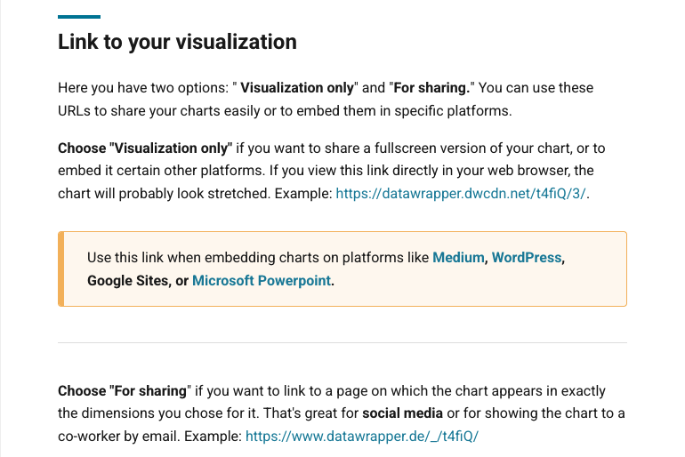
I’ve followed Datawrapper’s recommended instructions for these example embeds, but there are several other options. In the past, I’ve tried each of them. Specifically, if I try the “Responsive iframe” option in our WordPress, it will automatically convert it to the hyperlink style. A picture of those options is below:
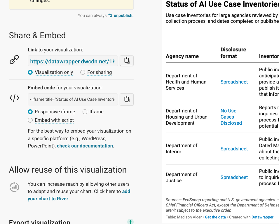
Specifically, Datawrapper recommends the “visualization only” hyperlink for WordPress.
Finally, this last one will only show if you’re in the editing mode for the file (i.e. not preview or the published version). The following is a custom iframe block in our WordPress that should allow for a fixed height. However, in addition to only showing up in the editing mode, it works only with the “for sharing” link, which appears as a webpage rather than clean graphic. I’m also uncertain that a fixed height would solve these problems in the first place — particularly for mobile.
Happy to answer any questions you might have, just let me know!