404 page: the error sites of federal agencies

Infusing a hint of humor or a dash of “whimsy” in government websites, including error messages, could humanize a federal agency to visitors. At least that’s how the National Park Service approaches its digital offerings, including its 404 page.
“Even a utilitarian feature, such as a 404 page, can be fun — and potentially temper any disappointment at having followed a link that is no longer active,” an NPS spokesperson said in an email to FedScoop. “Similar to our voice and tone on other digital platforms, including social media, our main goal is to always communicate important information that helps visitors stay safe and have the best possible experience.”
404 pages are what appear when a server cannot locate a website or resource at a specific URL. Hitting a 404 could be due to a number of reasons: a spelling error in the URL, the page may not exist anymore, or the server moved a page without having the link redirect. As a result of the error, many different entities with websites — such as state and local governments — have had a stroke of creative genius to make users aware of an issue while also having a bit of fun — which rings true for some federal agencies as well.
While 404 pages could seem like a silly or boring part of the federal government’s use of technology, there has been a significant push in the Biden administration, specifically out of the Office of Management and Budget, to enhance the user experience of federal agencies’ online presence — with a focus on accessibility.
NPS’s spokesperson said the agency strives to make its website “as user-friendly as possible” and “have processes in place” to make sure that the links are working.
Currently, the park service’s site has a revolving 404 page that showcases several different nature-themed images, with puns or quotes alongside information on how to get back on the right track for whatever online adventure a visitor seeks.

NPS said that it doesn’t have any plans to update its error page, “but we’re always working to better understand our users and to improve the user experience of NPS.gov and all our digital products.”
So, until further notice, visitors can still see an artistic rendering of a bear — complete with a relevant pun — if they get a little turned around on NPS’s site.
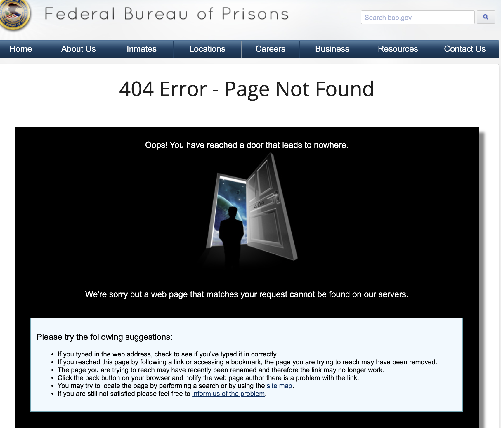
NPS isn’t alone in walking a line of informing the public about website miscommunications and simultaneously showcasing a bit of humor. The Federal Bureau of Prisons, for one, told FedScoop in an email that it “seeks to optimize the user experience in performance, access and comprehension.”

“The design of the FBOP’s 404 page was meant to be both functional and informative; by combining imagery with text, we educate the user as to the nature of a 404 error beyond standard system language and provide explanations as to why the error occurred,” Benjamin O’Cone, a spokesperson for FBOP, said in an email to FedScoop.
Unlike other agencies, the FBOP’s 404 imagery is not totally relevant to the mission of the bureau. Instead, it offers something a bit more meta than the others — referring to the 404 page as a “door that leads to nowhere.”
“While the Federal Bureau of Prisons (FBOP) seeks to ensure a fully responsive and evolving website, we recognize that there may be occasions where search engine indexing is outdated and may contain links to expired pages,” O’Cone said.
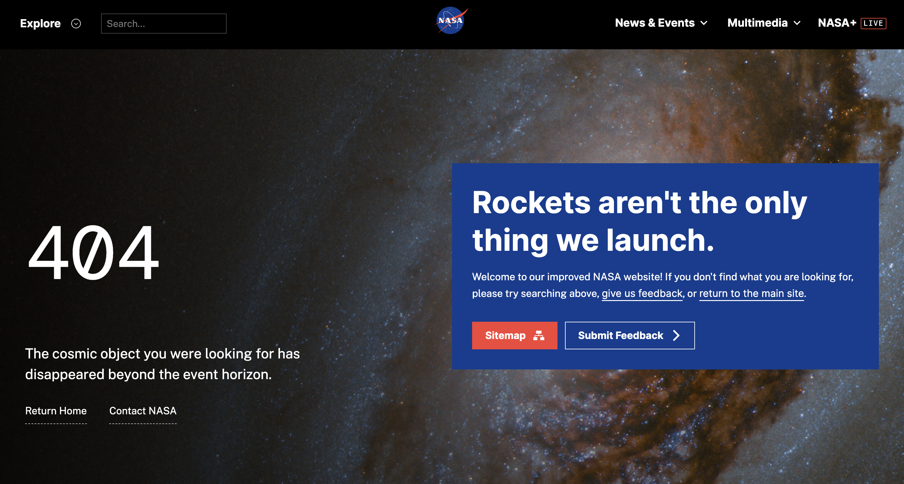
Similarly, NASA has a specific area of its 404 page that shares information about its updated, or “improved,” site, with an option to look at a sitemap and submit feedback. “Rockets aren’t the only thing we launch,” the agency muses.

This also comes with an equally creative 404 page, stating that the “cosmic object you were looking for has disappeared beyond the horizon,” against the backdrop of outer space.
Other websites, like the National Institute of Standards and Technology’s site, may not have artistic renderings or out-of-this-world visuals, but NIST instead shares a joke centered around the agency’s area of interest.

As NIST releases significant frameworks and updated guidance for different areas of federal technology use and deployment, it only makes sense that the agency refers to its error page as a request that isn’t standard.
While this collection of websites represents just a handful that add a creative touch to error messages, many government entities lack the same information and resources that others have.

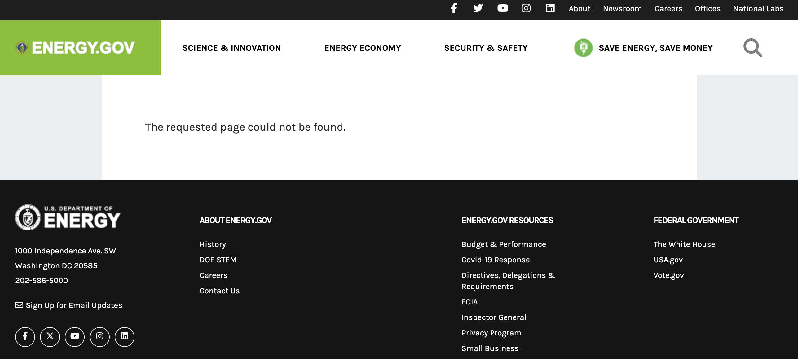
For example, see the Department of Energy, which simply states that “the requested page could not be found” and offers no further clue as to what a user could be experiencing.


